Commit 977b814.
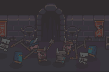
This is it. This is what BattleCrypt looks like right now for REALS. I really liked the progress I had on tiles using Photoshop to paint. However, it took forever to create tiles and was difficult to keep the continuity of style across elements. This is my natural style. This is the type of art I can do quickly, maintain a consistent feel across assets and be satisfied with the presentation. I’m still tweaking color palettes, ink lines and other stuff but I think I’m hitting my stride in the overall look.
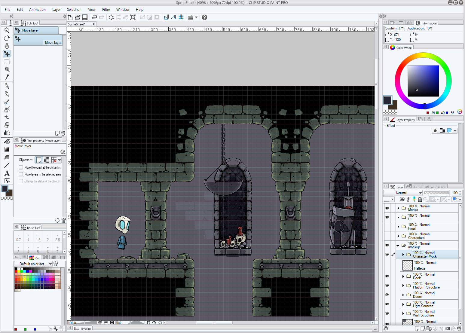
I started with this mockup work:
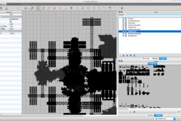
Then I recreated almost every Tiled asset I had created over several weeks in Photoshop in a few long, caffeinated evenings. I also overhauled characters and started sketching some UI stuff. Spells, particles and lots of that stuff are still screwy.
Is this style better than the previous? I don’t know. I like that style a lot too. But I can’t turn it around fast enough to bring the game together. Another thing I like a lot better about this is that it feels more “fun”. The other style’s more realistic feel was a bit dark and scary. I want this game to be something parents are comfortable letting their kids play. The theme, while it does have skeleton wizards, is not intended to be horrific, occult in any serious sense, or aligned with any particular religion. I think this style nails that so much better. Hope you like it!


