Masteroid has a growing amount of UI: faction dialogs, station menus, health bars, energy bars, menu screens. In this post, I explore how Masteroid content works and how I am planning and extending the UI to build better content faster!
I use a tool called Gum to create UI. Gum is a platform-agnostic visual editor that allows flexible and powerful UI layouts. Gum was created by Vic Chelaru, who also created the FlatRedBall game engine and happens to be a very good friend of mine. Gum allows me to quickly build UI components and then combine them into more complex components to create very rich UI. Note that while Gum is platform-agnostic, I believe only FlatRedBall has publicly-available plugins to render Gum in game. However, the Gum framework has been used to create the UI for Tetris Blitz (EA) and Champions of Anteria (Ubisoft) so it’s a proven tool on
One of the things I’m already working on for v0.5 of Masteroid (v0.4 releases on Friday 10/27/17!) is major tool enhancements. Sectors, weapons, ships, factions and more are all “data-driven” in Masteroid. That means that most of the content of the game is defined as a collection of data (in JSON format to be specific) and is read into the game at runtime. This means that I can create an entirely new sector and serve it up to gamers by updating the gamedata on the server without players having to download a new update.

So why haven’t I created way more ships, weapons and sectors? Well, the cop-out answer is that “balancing the game is hard” and “more content makes it harder to get player progression just right”. But the real truth is simply that my tools suck. I have a very crude ship editor tool that lets me define collision and engines for ships but I have to manually type and format JSON data for all of the other properties. I also have a sector editing tool, which looks pretty but is actually buggy and also requires a bunch of copy/pasting and other manual text editing to get a designed sector into game data. And I have NO tools for weapons. Weapons are created by manually editing yet another JSON file, setting color values by channel, etc. I did this intentionally!

This JSON data stuff isn’t necessarily a bad thing. I built a scalable, data-driven platform that empowers me to create and deploy new content in realtime! Very few indie games have something like that. But, I didn’t build the tools to facilitate the easy creation of that content. That time has come!
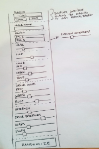
The first thing I try to do when planning any application is think about the user experience flow: how does a user navigate between screens and how are those screens organized in relation to one-another? After I plan that out, I try to wireframe the tools and components I need to build. So I went through the data model for a sector and thought about how I could create UI to populate every value in the model. Here’s the paper mock:
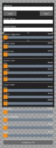
In Gum I had already built a slider control, a list box, buttons and lots of other components. I created a new “Color Picker” component that’s a group of three sliders representing RGB values. I also created a placeholder component for a text input box. That’s a component I haven’t created yet because Vic is working on adding that as a base component type to the FlatRedBall Gum implementation! After I had wireframed it out on paper, I created the new Sector Editor Menu component in Gum:
In the image above you’ll notice that the faction selector listbox is just a text field. I decided that would be WAY easier to implement at a very tiny cost to the artist* (they have to know the faction names and spell them right). You’ll also know that the UI extends below the black background. That’s because I have my screen size set to 800×800 in Gum. This forces me to think about UI that doesn’t fit. In this case, the menu will probably have to scroll vertically in case the artist* is working on a laptop or other smaller screen.
So the UI is created. The next step is to bind up events and properties to the actual game and do testing. A lot of the next version of the game is about doing this exact process to create robust tools. I have actually already created a variety of new ship and weapon sprites. The only reason gamers can’t enjoy them yet is because getting them into data is a pain. As soon as I get this fixed, the game will get a lot more expansive with a lot more progression options!
One final note about Gum: all of my complex UI is assembled from a couple of simple base objects: list boxes, buttons, checkboxes, sliders and line items. Right now all of those components are created from simple colored rectangles. This allows me to lay out UI and rapidly iterate on functionality without a lot of pixel redesign. Once the functionality of the UI is fairly stable, I’ll actually redesign the look and feel in Photoshop. The cool thing is that it should be pretty quick to swap colored rectangles with sprites and “skin” the UI to better fit the game!
* I refer to the “artist” as if they are a separate person because in a lot of games they are. But I do almost everything in Masteroid so the artist is just me!


