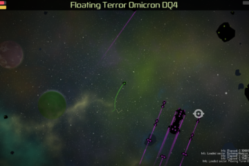
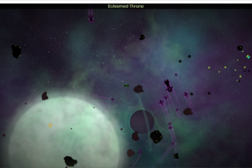
UI overhaul was the theme for the Andromeda release. It’s worth noting that going forward, releases will be named in alphabetical order with a space theme.
Overhauling the UI was a big effort. While it doesn’t add a lot of gameplay depth for players, it does make the game systems a little more accessible and enables me to add a lot more depth to weapons, ships and faction missions. The UI communicates information much more effectively (and prettily if I do say so myself).
Here are the new features for Andromeda:
- All menus redesigned including
- Title screen
- Settings screen
- Station menu
- Pause menu
- Dialog box
- Warp menu
- HUD
- All ships now have icons and descriptions
- All weapons now have icons and descriptions
- Warp menu is now sorted by faction and rough difficulty of the sector
- Weapon and Ship lists are now sorted by cost
- Improved error logging to better respond to user-filed bugs
- Fixed bug with too many sounds crashing the game
- Fixed bug with empty turrets crashing the game
- Fixed bug with owned weapons sometimes disappearing from inventory
- Fixed minor bug where sometimes AI ships don’t get a usable weapon
The next release focuses on performance updates and the mission system.
Thanks for playing,
Justin

